Class 7
Quarto, Tidy Data, Pivoting
Preparation Materials
Agenda
Today we’ll focus on:
- Quick review from last class (source now revealed on class page)
- Homework 1 pre-survey
- Quarto html documents
- Tidy data - focus on pivoting
- In-class exercises
Homework 1
For homework 1, we’ll be analyzing our own class data on some linguistic variation in English. To prepare for that, we need to collect the data. One of the assignments for next class is to complete the survey!
Tidy Data and Reshaping Functions
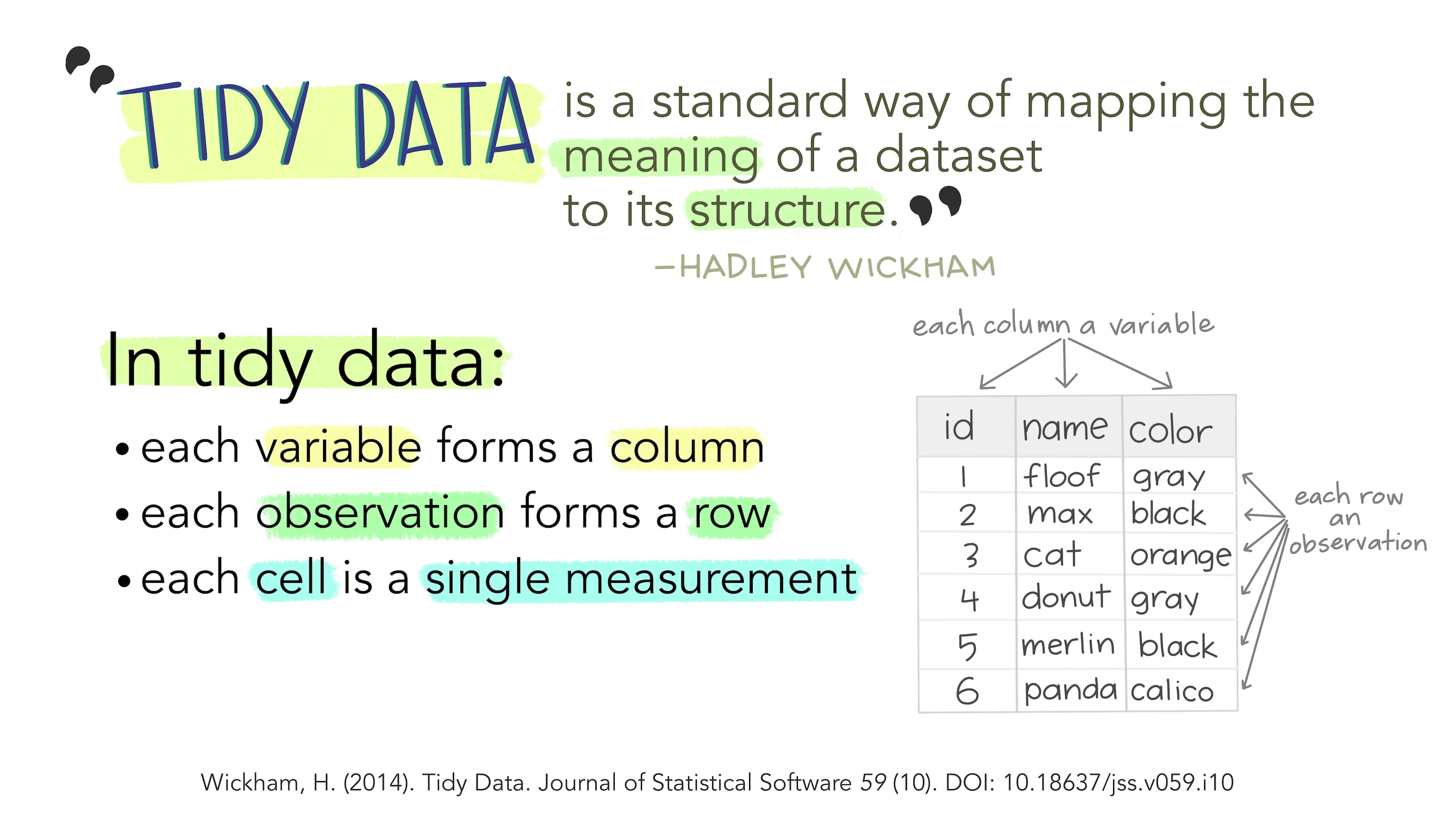
Pivoting Data
Pivoting data in R refers to changing between “wide” and “long” formats. Long formats are considered “tidy”, but sometimes we want to analyze or present data in wide format as well.
One helpful thing to remember about the pivoting functions is that generally you pivot wider “from”, and pivot longer “to”. Any good mnemonics for that?
Some data that often are in wide format are grades. Let’s make some up. You can copy/paste this code to get the same data.
# setting a "seed" is a way of reproducing the same "random" samples
set.seed(343)
df_grades <- tibble(
  ID = as.factor(seq(1:50)),
  section = as.factor(rep(1:5, 10)),
  quiz1 = sample(1:100, 50, replace = TRUE),
  quiz2 = sample(1:100, 50, replace = TRUE),
  quiz3 = sample(1:100, 50, replace = TRUE)
) |>
  arrange(section)
df_grades
#> # A tibble: 50 × 5
#> ID section quiz1 quiz2 quiz3
#> <fct> <fct> <int> <int> <int>
#> 1 1 1 77 41 69
#> 2 6 1 38 20 78
#> 3 11 1 52 42 63
#> 4 16 1 95 45 25
#> 5 21 1 12 77 59
#> 6 26 1 6 12 5
#> 7 31 1 88 5 87
#> 8 36 1 71 39 61
#> 9 41 1 71 97 99
#> 10 46 1 58 7 20
#> # ℹ 40 more rowsHere we have the grades wide - each quiz has its own column. This is easy to get a summary of the overall class average for each quiz, or to group by section:
df_grades |>
  summarize(q1 = mean(quiz1, na.rm = TRUE),
            q2 = mean(quiz2, na.rm = TRUE),
            q3 = mean(quiz3, na.rm = TRUE))
#> # A tibble: 1 × 3
#> q1 q2 q3
#> <dbl> <dbl> <dbl>
#> 1 42.2 45.4 52.7df_grades |>
group_by(section) |>
summarize(q1 = mean(quiz1, na.rm = TRUE),
q2 = mean(quiz2, na.rm = TRUE),
q3 = mean(quiz3, na.rm = TRUE))#> # A tibble: 5 × 4
#> section q1 q2 q3
#> <fct> <dbl> <dbl> <dbl>
#> 1 1 56.8 38.5 56.6
#> 2 2 25.3 40.3 52.1
#> 3 3 31.4 56.1 59.4
#> 4 4 47.7 39.5 54.2
#> 5 5 50 52.5 41.4However, it is not easy to plot this data because the scores are all in separate variables (and cannot be part of the same aesthetic). To get those quiz scores together in tidy format, we can pivot longer:
df_grades_long <- pivot_longer(
  df_grades,
  cols = c(quiz1, quiz2, quiz3),
  names_to = "quiz",
  values_to = "score")
df_grades_long |>
  ggplot(aes(x = quiz, y = score, color = ID, group = ID)) +
  geom_line()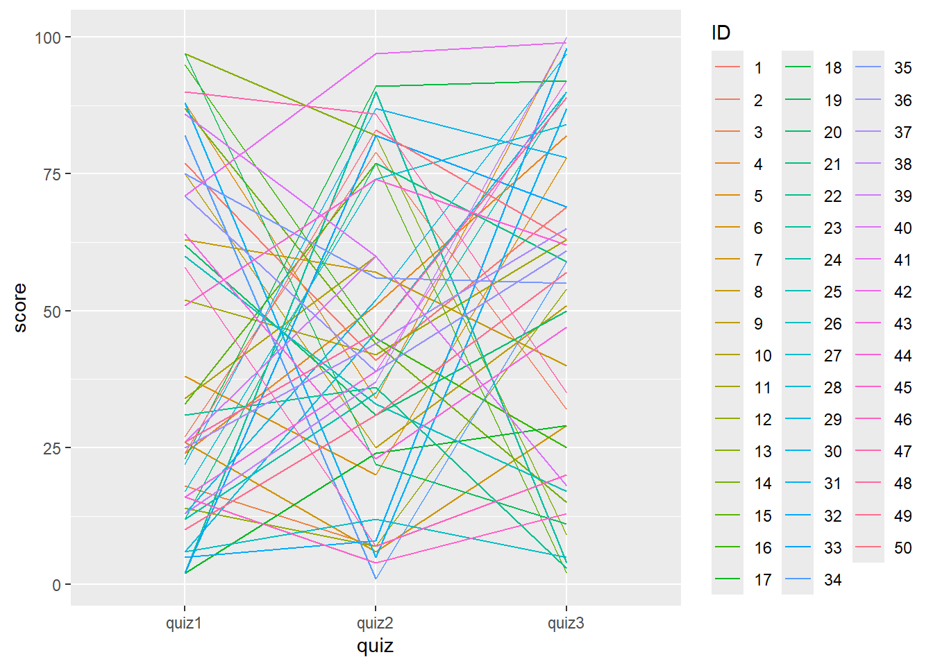
This plot is a bit silly because the grades are random, but the point is now we can plot it.
We could also plot the scores by section means:
df_grades_long |>
  group_by(section, quiz) |>
  summarize(mean = mean(score, na.rm = TRUE)) |>
  ggplot(aes(x = quiz, y = mean, group = section, color = section)) +
  geom_line()
#> `summarise()` has grouped output by 'section'. You can override using the
#> `.groups` argument.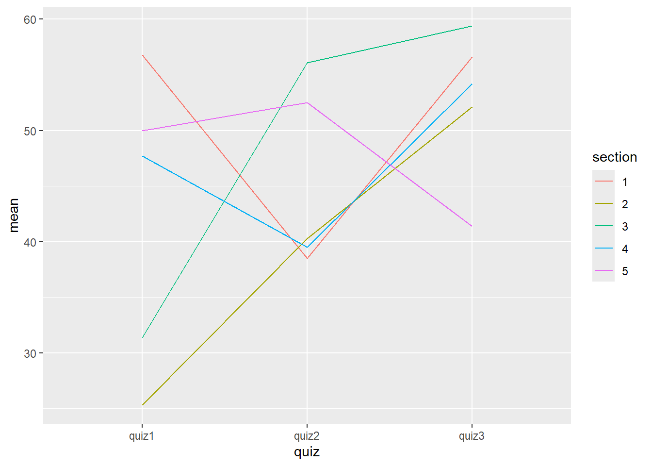
If we want it to go wide again, we can use pivot_wider():
df_grades_wide <- df_grades_long |>
  pivot_wider(names_from = quiz, values_from = score)
df_grades_wide
#> # A tibble: 50 × 5
#> ID section quiz1 quiz2 quiz3
#> <fct> <fct> <int> <int> <int>
#> 1 1 1 77 41 69
#> 2 6 1 38 20 78
#> 3 11 1 52 42 63
#> 4 16 1 95 45 25
#> 5 21 1 12 77 59
#> 6 26 1 6 12 5
#> 7 31 1 88 5 87
#> 8 36 1 71 39 61
#> 9 41 1 71 97 99
#> 10 46 1 58 7 20
#> # ℹ 40 more rowsIn-class activity
Let’s work together in our Quarto document on an in-class engagement assignment (instead of iClicker points). At the end, you’ll submit your file to Gradescope.
Here is a copy of the questions/tasks:
With the babynames dataset:
- Pivot the data so that there is only one row per name per year, with the values corresponding to sex “M” and sex “F” across the same row. (Make it less tidy!)
- Create a new column with the total ‘n’ for the year across both sexes. (you may want to go back to the Posit Primers for this!)
- Choose 5 names and plot lines for their ‘n’ across all years total across both sexes, so that each line has a different color.
- Change the colors to something other than the defaults.
- Now choose one name and make a plot with separate lines (different colors) for ‘n’ with sex “M” and ‘n’ with sex “F”. You have to figure out what shape your data should be in to do this - tidy or untidy? How do you get those variables to align with different colors?
- Pivot the original babynames dataframe to have separate rows for ‘n’ and ‘proportion’ data.
- Why can’t you pivot ‘sex’ together with ‘n’ and ‘prop’?
- Where did you observe ‘NA’ values? Why do you think they appeared?