Class 9
Data Exploration
Preparation Materials
Agenda
Today we’ll focus on:
- Code notes
- Examining some fake data with review
- Homework 1 troubleshooting
- Quarto questions/issues?
You’re doing great!
Some encouragement from Allison Horst:
Checking your Outputs, or == vs %in%
This doesn’t do what you might think:
What do you notice if you compare with this version?
To understand what’s going on, consider this demo. I’m going to create a mini dataframe to see more easily what is happening.
thenames <- c("Walter", "Saul", "Skylar", "Jessie", "Mike")

df_mini <- tibble(name = c(thenames, rev(thenames)),
                  number = c(rep("inorder",5), rep("reversed",5)))
df_mini
#> # A tibble: 10 × 2
#> name number
#> <chr> <chr>
#> 1 Walter inorder
#> 2 Saul inorder
#> 3 Skylar inorder
#> 4 Jessie inorder
#> 5 Mike inorder
#> 6 Mike reversed
#> 7 Jessie reversed
#> 8 Skylar reversed
#> 9 Saul reversed
#> 10 Walter reversedTry these out on your computer and see what you get:
- using
== - using
%in%
== is going through each row and checking for equivalence to one value - whichever one it has cycled to! With %in% it is checking whether the name in that row is any of the ones in the vector of five names.
sum()
As discussed last class, nother quirky item to note is that the function sum() does not return vectors, but is a “summary” type function which means it reduces to one value (a length-one vector). This is the kind of information in the “value” section of the help file. If you want to add vectors element-wise, you can use +.
#> # A tibble: 159 × 6
#>     year sex   name      n      prop   total
#>    <dbl> <chr> <chr> <int>     <dbl>   <dbl>
#>  1  1886 F     Lisa      6 0.0000390 967762.
#>  2  1896 F     Lisa      5 0.0000198 967762.
#>  3  1899 F     Lisa      7 0.0000283 967762.
#>  4  1904 F     Lisa      9 0.0000308 967762.
#>  5  1905 F     Lisa      5 0.0000161 967762.
#>  6  1907 F     Lisa      7 0.0000207 967762.
#>  7  1910 F     Lisa      9 0.0000214 967762.
#>  8  1911 F     Lisa      9 0.0000204 967762.
#>  9  1912 F     Lisa      7 0.0000119 967762.
#> 10  1913 F     Lisa     16 0.0000244 967762.
#> # ℹ 149 more rows#> # A tibble: 159 × 6
#> year sex name n prop total
#> <dbl> <chr> <chr> <int> <dbl> <dbl>
#> 1 1886 F Lisa 6 0.0000390 6.00
#> 2 1896 F Lisa 5 0.0000198 5.00
#> 3 1899 F Lisa 7 0.0000283 7.00
#> 4 1904 F Lisa 9 0.0000308 9.00
#> 5 1905 F Lisa 5 0.0000161 5.00
#> 6 1907 F Lisa 7 0.0000207 7.00
#> 7 1910 F Lisa 9 0.0000214 9.00
#> 8 1911 F Lisa 9 0.0000204 9.00
#> 9 1912 F Lisa 7 0.0000119 7.00
#> 10 1913 F Lisa 16 0.0000244 16.0
#> # ℹ 149 more rowsSurvey Data Practice
What questions might we want to answer about our own survey data?
Important to working with any data - what are we trying to understand or learn from it? This shapes what you do with it. Tidy Tuesday is a good exercise in this part of working with data - you are given some data and have to come up with your own ideas of what you want to look for, and shape your analysis based on that.
Usually in research or industry, you already know some of the questions you want to answer with the data.
We will talk more next week about “confirmatory” vs. “exploratory” analysis. For now I’ll just say that what we are doing is very exploratory! We did not clearly define hypotheses to test before analyzing our data. we’re just exploring what we might find in it.
Cleaning and Tidying Data Practice
What code do we never want to leave uncommented in scripts?
- library()
- install.packages()
- data()
- set.seed()
Let’s recreate the data from last time:
df_sample <- tibble(
  # generate 50 different names
  `full name` = ch_name(50),
  # generate 10 different jobs and repeat 5 times
  job = rep(ch_job(10),5),
  # sentence ratings randomly sampled on a 0-10 scale with preset means
  `1` = sample(0:10, prob = dnorm(0:10, mean = 8.5, sd = 1), size = 50, replace = TRUE),
  `2` = sample(0:10, prob = dnorm(0:10, mean = 8.5, sd = 1), size = 50, replace = TRUE),
  `3` = sample(0:10, prob = dnorm(0:10, mean = 5, sd = 1), size = 50, replace = TRUE),
  `4` = sample(0:10, prob = dnorm(0:10, mean = 4, sd = 1), size = 50, replace = TRUE)
) |> janitor::clean_names() |>
  group_by(full_name) |>
  mutate(ID = cur_group_id(), .before = full_name)
You’re data should now look like:
#> # A tibble: 50 × 7
#> # Groups:   full_name [50]
#>       ID full_name          job                             x1    x2    x3    x4
#>    <int> <chr>              <chr>                        <int> <int> <int> <int>
#>  1    31 Kim Metz           Transport planner                9    10     6     4
#>  2    13 Dr. Chad Kling IV  Medical secretary                8     6     3     5
#>  3     6 Chancy Schowalter  Naval architect                  8     7     6     3
#>  4    47 Pierce Klein       Editorial assistant              8     9     4     5
#>  5    27 Jazmyn Abernathy   Arboriculturist                  9     9     5     1
#>  6    30 Kieth Christiansen Designer, multimedia             9     9     3     4
#>  7    32 Kyan Goldner       Education administrator          8     9     5     3
#>  8    24 Frazier Senger     Food technologist                7    10     4     3
#>  9     1 Abbott Smitham IV  Education officer, museum        8     8     6     4
#> 10    46 Pearl Schmidt      Teacher, English as a forei…    10     8     4     2
#> # ℹ 40 more rows- Change the
jobvariable to be a categorical factor usingas.factor().
What is your code to do this?
We want to plot the ratings. Let’s assume that the variables named x1 and x2 are predicted to be acceptable sentences, and the ones named x3 and x4 are predicted to be unacceptable.
- Pivot the data so that it is in tidy (long) format.
- We want to plot the mean ratings for good vs. bad sentences (not the best way to handle likert ratings!), with the sentence category on the x-axis. First do a preparation summary - this is an item mean since we are grouping by the sentence items.
#> # A tibble: 4 × 2
#> sentence mean
#> <chr> <dbl>
#> 1 x1 8.6
#> 2 x2 8.44
#> 3 x3 4.8
#> 4 x4 4- Now use that summarized data to plot points for the item means.
df_ratings |>
  group_by(sentence) |>
summarize(mean = mean(rating, na.rm=TRUE)) |>
ggplot(aes(x = sentence, y = mean)) +
geom_point()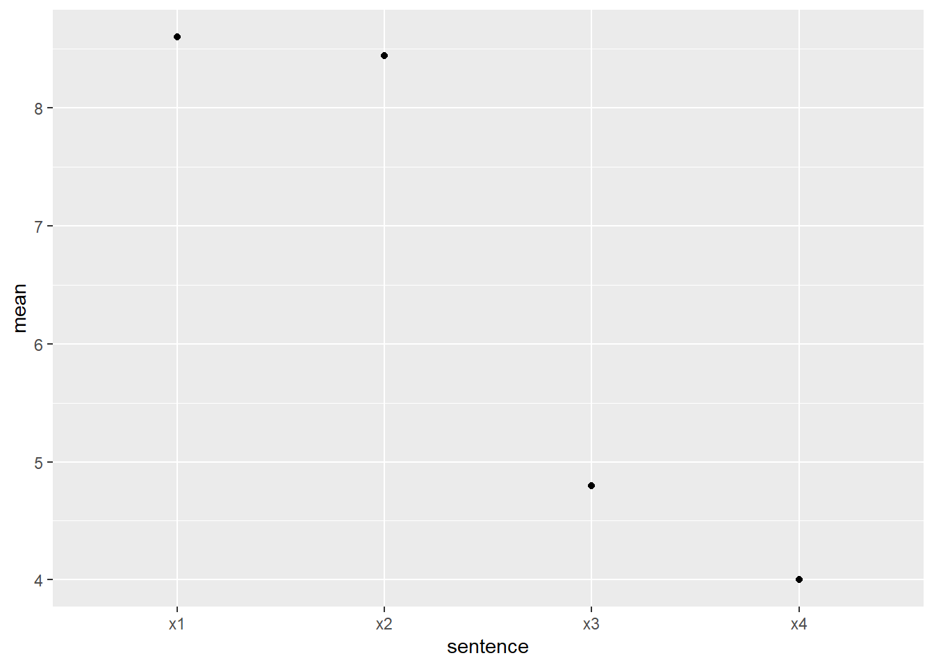
- Let’s see how much variation there was in the data. Plot the individual points of data grouped in the same way, to look like this:

Why are there so few dots, if we had 50 participants?
df_ratings |>
  ggplot(aes(x = sentence, y = rating)) +
  # geom_jitter and position set some space for points to spread out
  # alpha sets transparency for points
  geom_jitter(alpha = .6, position = position_jitter(width = 0.1, height = 0.1)) +
  # adding explicit breaks helps to read the y axis
  scale_y_continuous(breaks = 0:10)
Here’s the example from class using color for individual participants:
df_ratings |>
  # need to convert ID to factor to not treat as continuous scale
  ggplot(aes(x = sentence, y = rating, color = as.factor(ID))) +
  geom_jitter(alpha = .6, position = position_jitter(width = 0.1, height = 0.1)) +
  scale_y_continuous(breaks = 0:10) +
  # remove the legend by setting position to "none"
  theme(legend.position = "none") +
  # adding a title to explain the color without a legend
  labs(title = "Ratings by Sentence (with color for ID)")
Here are some other ways to represent the number of responses at each rating, just to preview some other options. These all have to “grab” the count from somewhere - the geom geom_count() does this behind the scenes for you; otherwise you need to calculate a count variable that can be plotted. There are various ways to do this, but here are some of the simpler options for this specific case:
df_ratings |>
  ggplot(aes(x = sentence, y = rating)) +
  # change point size by count using geom_count()
  geom_count() +
scale_y_continuous(breaks = 0:10) 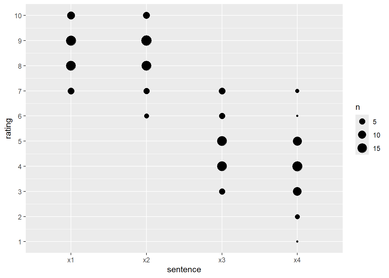
# by creating a summary count first
df_ratings |>
  group_by(sentence, rating) |>
  count() |>
  ggplot(aes(x = sentence, y = rating, size = n)) +
  geom_point()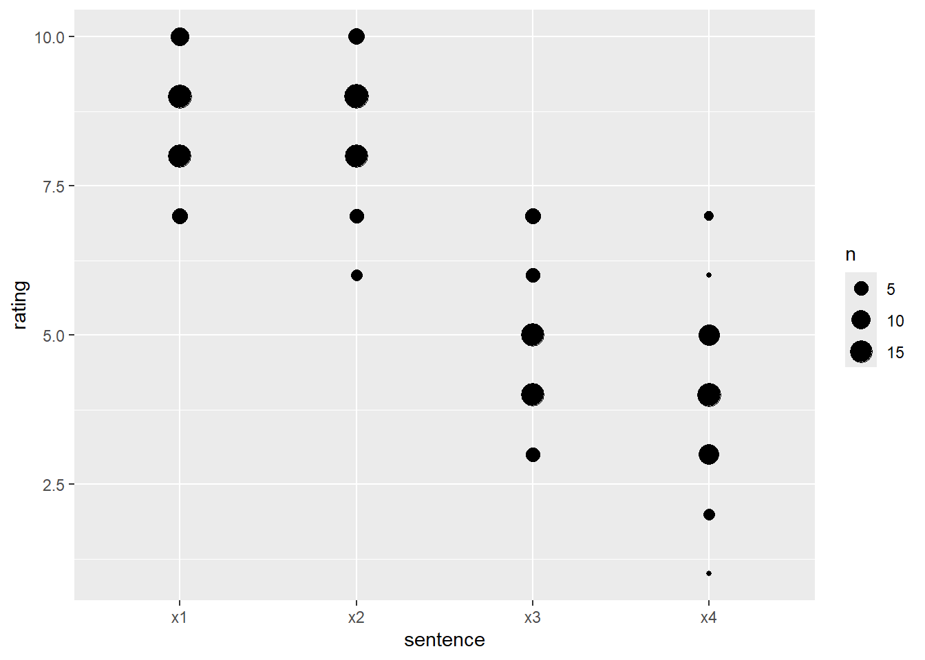
# for colors by creating a summary count first
df_ratings |>
  group_by(sentence, rating) |>
  count() |>
  ggplot(aes(x = sentence, y = rating, color = n)) +
  geom_point()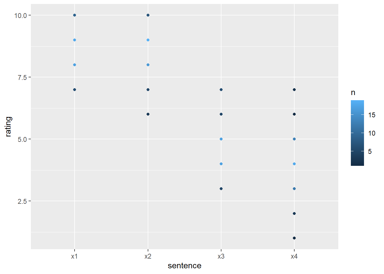
We will talk about nicer ways to plot these types of data when we return to data visualization!
- If we want to generalize over multiple good and bad sentences, we need a variable that represents that. We can do this by mutating with the
if_else()function, which allow us to create a new variable based on the value of another one. There are also various ways to match the other variable, depending on whether it is a string, number, etc.
df_ratings <- df_ratings |>
  # if sentence is 'x1' or 'x2', the new column should say "good"
  # otherwise, use "bad"
  mutate(condition = if_else(sentence %in% c("x1","x2"), "good", "bad"))
df_ratings
#> # A tibble: 200 × 6
#> # Groups: full_name [50]
#> ID full_name job sentence rating condition
#> <int> <chr> <fct> <chr> <int> <chr>
#> 1 31 Kim Metz Transport planner x1 9 good
#> 2 31 Kim Metz Transport planner x2 10 good
#> 3 31 Kim Metz Transport planner x3 6 bad
#> 4 31 Kim Metz Transport planner x4 4 bad
#> 5 13 Dr. Chad Kling IV Medical secretary x1 8 good
#> 6 13 Dr. Chad Kling IV Medical secretary x2 6 good
#> 7 13 Dr. Chad Kling IV Medical secretary x3 3 bad
#> 8 13 Dr. Chad Kling IV Medical secretary x4 5 bad
#> 9 6 Chancy Schowalter Naval architect x1 8 good
#> 10 6 Chancy Schowalter Naval architect x2 7 good
#> # ℹ 190 more rows- How would you do a participant mean for the good vs bad sentences?
#> # A tibble: 100 × 3
#> # Groups:   ID [50]
#>       ID condition partmean
#>    <int> <chr>        <dbl>
#>  1     1 bad            5
#>  2     1 good           8
#>  3     2 bad            4
#>  4     2 good           8.5
#>  5     3 bad            5.5
#>  6     3 good           8
#>  7     4 bad            5
#>  8     4 good           7
#>  9     5 bad            3
#> 10     5 good           8.5
#> # ℹ 90 more rows- What about the grand average for good and bad sentences? That is the mean of all the participants’ means by condition.
#> # A tibble: 2 × 2
#>   condition grandmean
#>   <chr>         <dbl>
#> 1 bad            4.4
#> 2 good 8.52- Can you analyze the ratings grouped by job? Are they lower or higher depending on the participant’s occupation?
Homework 1 Troubleshooting
This is a time for me to help you with individual Homework 1 challenges.
If you are done with Homework 1, choose your own adventure: