#> [1] 1#> [1] 2#> [1] 3Projects and More Visualization
No preparation reading was assigned, but we will/may refer to this material today:
Today we’ll focus on:
How would you represent something on a log scale, rather than a linear scale? For reference, the log(arithmic) scale is a way of transforming numbers that have equal spacing between exponents, such as 10, 100, 1000, etc. This is used for a variety of purposes, including the Richter magnitude scale (for earthquakes).
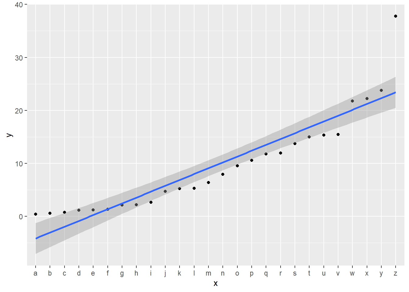
Some data show an exponential pattern:
# create some exponential data
set.seed(343)
df_exp <- tibble(x = letters, y = sort(rexp(26, rate = .1)))
ggplot(df_exp, aes(x = x, y = y, group = 1)) +
  geom_point() +
  geom_smooth(method = loess)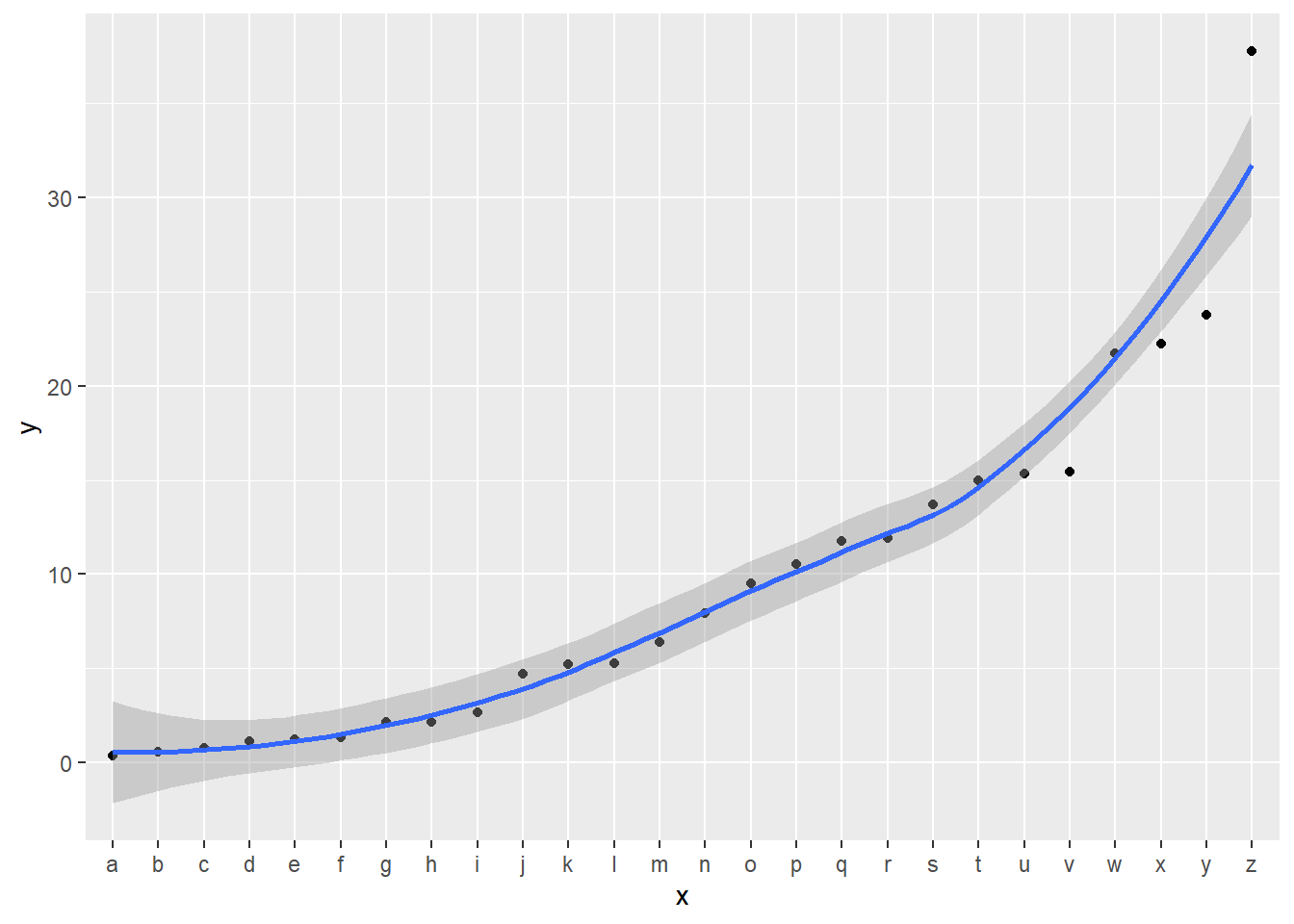
It doesn’t map well to a linear analysis:
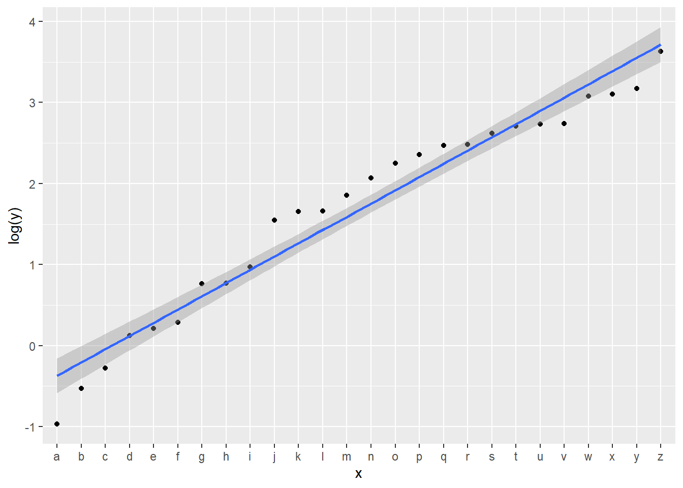
It can be useful to transform the values to a log scale. Depending on the purpose, this can be done by mutating the data, or by changing the axis scale:
Using scale_y_log10(), the values are shown on the linear scale, but spaced according to the log scale:
ggplot(df_exp, aes(x = x, y = y, group = 1)) +
  geom_point() +
  scale_y_log10() +
  geom_smooth(method = lm)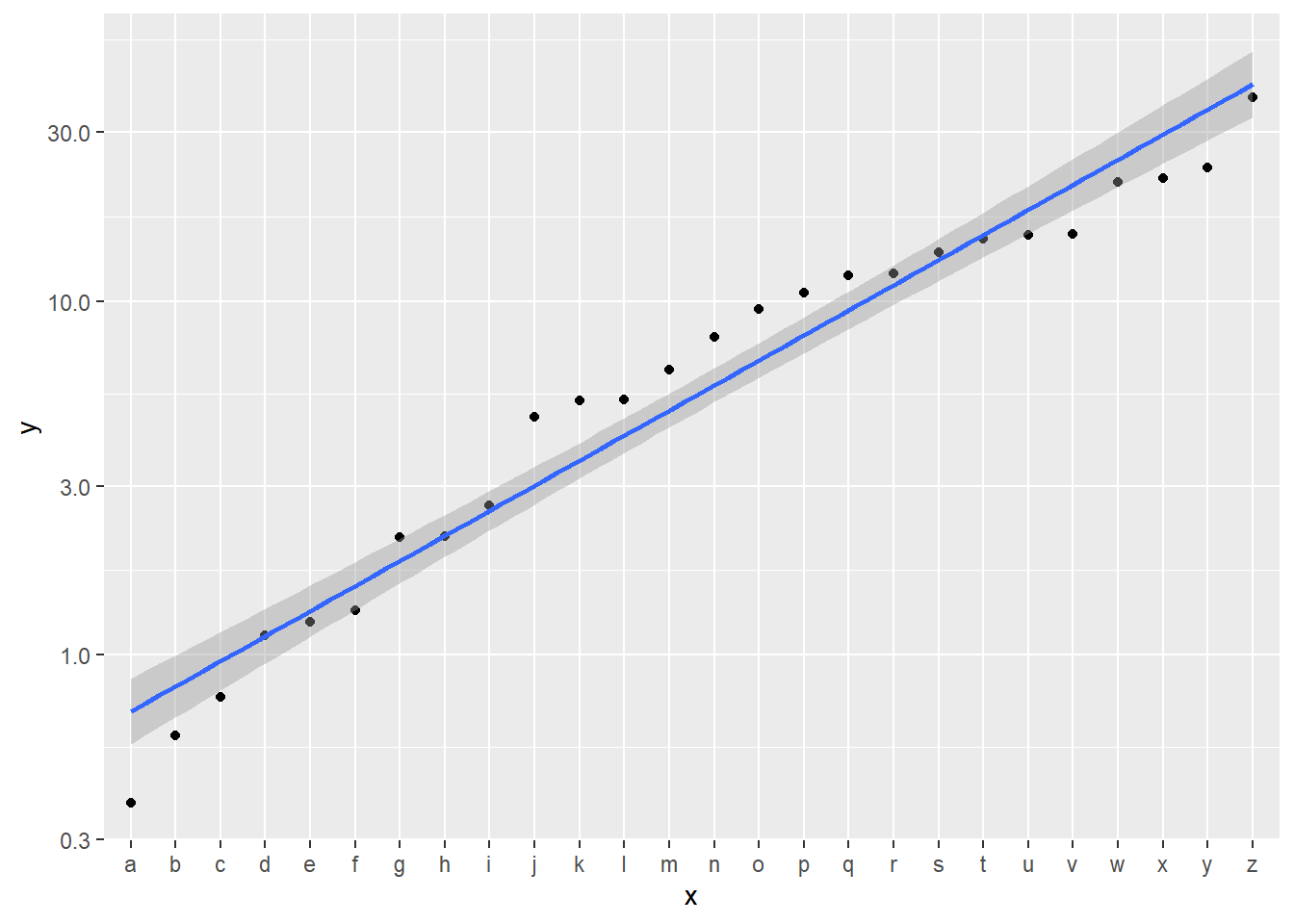
There are many other transformations you can do with scales in ggplot2 depending on your use case, including custom ones. The reference is in the scales documentation. Here’s an example using a different log scale:
ggplot(df_exp, aes(x = x, y = y, group = 1)) +
  geom_point() +
  scale_y_continuous(transform = scales::log2_trans()) +
  geom_smooth(method = lm)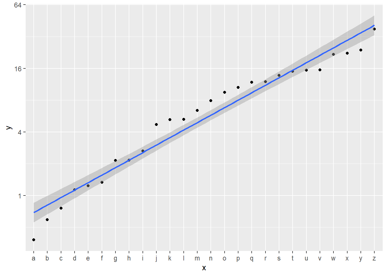
You can also change the coordinates, which is done after statistics. There is a good demonstration of these differences in the documentation of coord_trans.
In order to setup the “bikes” data for the materials, use this code:
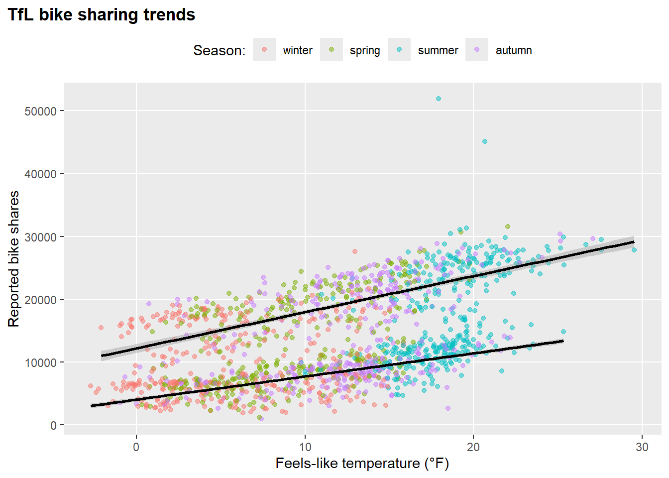
Example plot from the tutorial:
  ggplot(
    bikes,
    aes(x = temp_feel, y = count,
        color = season,
        group = day_night)
  ) +
  geom_point(
    alpha = .5
  ) +
  geom_smooth(
    method = "lm",
    color = "black"
  ) +
  labs(
    x = "Feels-like temperature (°F)",
    y = "Reported bike shares",
    title = "TfL bike sharing trends",
    color = "Season:"
  ) +
  theme(
  panel.grid.minor = element_blank(),
  plot.title = element_text(face = "bold"),
  legend.position = "top",
  plot.title.position = "plot"
)
We will use Cédric Scherer’s slides and work through those examples live in class. I will post any additional code from class here afterwards.